From time to time you are going to have customers that need you to match a specific color and most likely it is a Pantone chart color. The thing is Pantone colors are used by mixing percentages of specific colors to create a color. It’s like when they match house paint, a base color with so much of another color or colors to match it. With DTG it is being done digitally and not by hand mixing ink so you end up with a lot more factors to deal with when trying to match a color.
The color range of CMYK and the quality of your RIP program can make things hard to match specific colors right on the nose. When it came to the Direct Rip program we use, a lot of time was spent color profiling to get the best match possible using CMYK. We also made it so this print quality is duplicated using only default settings. With many other programs lots of adjustments and test prints need to be done even try and match a color.This is time consuming and costs you money in ink and wasted garments.
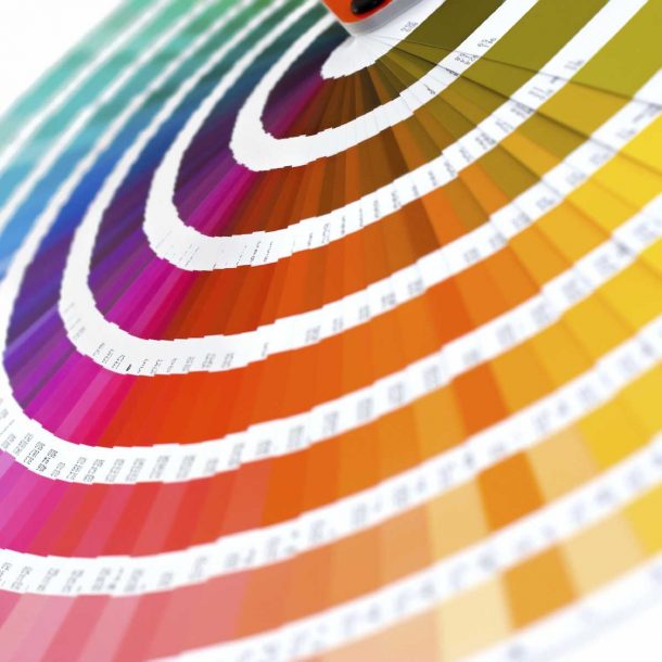
You can find many Pantone and color charts online to download. The best thing to do is to print the color chart onto a black and white shirt and find the best match to the color you need. The color chart will give you the CMYK and RGB values used to create this color in your graphics program like Photoshop. I really think the best thing to do is purchase a Pantone color chart, this way you have the actual real color in hand to find your match. Trying to match it to a color on your monitor may not be 100% because monitors are very rarely showing the exact color. If you can get a sample of the color printed on something from the customer and match it to the color chart you have printed. This may sound funny but it is very true, make sure you or the person matching the colors is not color blind. It happens more often than you think.
