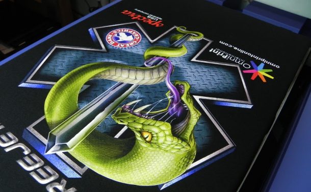
When you think about getting a great print the major factor of the print quality is the image itself. Because this is a digital print the graphic itself should be top notch, good resolution (300dpi) and at the size you are going to print it at or bigger. But sometimes even a good image may not give you that extra pop to take it to the next level.
In general when you print a graphic onto a shirt you may notice it is not as vibrant as you see on your monitor. The first and main reason for this is that your monitor has light behind it and it creates a much warmer and brighter look. The other reason is because you are printing on a shirt it requires a good amount of ink to create good coverage. This amount of ink may darken up the image a little because of the saturation required.
Using a program like Photoshop, Corel draw or any good graphics program will allow you to do some minor editing to get that pop you need. You should be able to find a function in the program to edit the Hue and Saturation of the image you want to print. In Photoshop you will notice you are given an adjustment for hue, saturation and also lightness. You can use a global setting the will affect the entire image at once. You will see that hue will totally change the entire look and color of the image. As you increase the saturation you will see the colors get more vibrant if they can. And brightness will make the entire image brighter. I don’t suggest using the global setting though, you should have a drop down that will let you select cyan, magenta, yellow, red and blue individually. I like to go through each color and see if the saturation increase gives it more pop. The last thing is do is increase the lightness on the entire image. You don’t need to do much, no more than 20%. What this will do is counter act the fact that when it prints it’s a little darker. If it’s a little lighter then when it prints a little darker you are in the right spot. Give this some testing, you may open up a whole new pop to your prints.

